jQuery Product Slider with animation
Include Files
Include jQuery and ImagesLoaded if you don't have it.
                <script type="text/javascript" src="assets/jquery.min.js"></script>
<script src="assets/imagesloaded.pkgd.min.js"></script>


<link rel="stylesheet" href="product-slider.css">
<script type="text/javascript" src="product-slider.js"></script>
HTML Markup
                 <div id="demo1" class="product-container">
    <div class="product-item-container">
        <div class="product-item" data-animation="wobble" data-background="to right bottom|#7f7c7c 10%|#010101 100%">
            <header class="product-item-header">
                <img class="product-image" src="images/cars/1.png" alt="">
                <span class="product-item-header-price">4.99 EUR </span>
            </header>
            <section class="product-item-content">
                <div class="product-title">
                    Oldtimer 1
                </div>
                <div class="product-rating">
                    <i class="fa fa-star"></i>
                    <i class="fa fa-star"></i>
                    <i class="fa fa-star"></i>
                    <i class="fa fa-star"></i>
                    <i class="fa fa-star gray"></i>
                </div>
                <div class="product-description">
                    Lorem ipsum dolor sit amet, consetetur sadipscing elitr, sed diam nonumy eirmod tempor invidunt ut labore et dolore magna aliquyam erat, sed diam voluptua.
                </div>
                <div class="product-price">
                    <span>4.99</span>
                    <a href="#">Details</a>
                </div>
            </section>
        </div>

        <div class="product-item">
        .....
        </div>
    </div>
</div>
Call Plugin
                <script type="text/javascript">
    $(function () {
        $('#demo1').ProductSlider({
            //YOUR CUSTOM SETTINGS
            startSlider: 4,
            prevBtn: '<i class="fa fa-chevron-left"></i>',
            nextBtn: '<i class="fa fa-chevron-right"></i>'
        });
    });
</script>
Settings
                           <script type="text/javascript">
   $(function () {
       $('#demo1').ProductSlider({
           startSlider: 2,
           itemWidth: 200,
           animation: 'fadeIn',
           background: 'to right bottom|#fff 10%|#000 100%',
           hideBefore: false,
           showDotNavigation: false,
           showArrowNavigation: false,
           prevKey: 37,
           nextKey: 39,
           prevBtn: '<i class="fa fa-chevron-left"></i>',
           nextBtn: '<i class="fa fa-chevron-right"></i>'
       });
   });
</script>
You can override the default animation and background for each slider with data attributes.
<div class="product-item" data-animation="wobble" data-background="to right bottom|#7f7c7c 10%|#010101 100%">
| startSlider | default: null [int] |
Set your start slider |
| itemWidth | default: 250 [int] for pixel or [string] for percentage |
Width of the inner item container itemWidth: 200, width of 200px itemWidth: '50%', width is 50% from the parent width |
| animation | default: 'bounceIn' [string] |
Set your default animation for all slider images...this is your css class you can get css animations here |
| background | default: 'to right bottom|#fff 10%|#000 100%' [string] |
Set your linear gradient for the background, 'direction|color1|color2' |
| hideBefore | default: true [boolean] |
Image will be set to opacity: 0 before next slide, and after animation is finished, it will stay on opacity: 1, this depends on your animation |
| showDotNavigation | default: true [boolean] |
Display the dot navigation |
| showArrowNavigation | default: true [boolean] |
Display the arrow navigation |
| prevKey | default: 37 [int] |
The keycode for prev slide, 37 = left arrow |
| nextKey | default: 39 [int] |
The keycode for next slide, 39 = right arrow |
| nextBtn | default: 'next' [string] |
image, string or font icon for next button this demo is using fontAwesome: '<i class="fa fa-chevron-right"></i>' |
| prevBtn | default: 'prev' [string] |
image, string or font icon for previous button this demo is using fontAwesome: '<i class="fa fa-chevron-left"></i>' |
Included Anmations
You can crate your own custom css animation or get some from here http.//www.theappguruz.com
- .bounceIn
- .bounceInDown
- .bounceInLeft
- .fadeIn
- .lightSpeedIn
- .rubberBand
- .shake
- .tada
- .zoomInDown
Recent Oldtimers
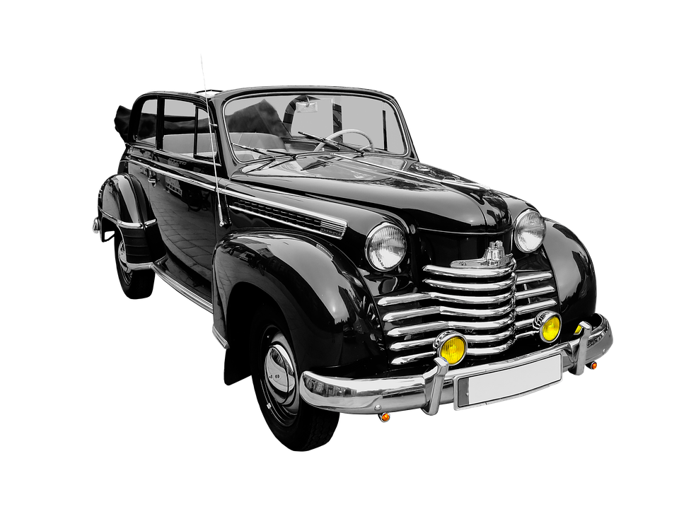 4.99 EUR
Oldtimer 1
Lorem ipsum dolor sit amet, consetetur sadipscing elitr, sed diam nonumy eirmod tempor invidunt ut labore et dolore magna aliquyam erat, sed diam voluptua.
4.99
Details
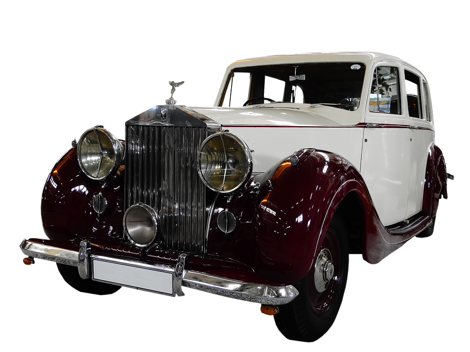 9.99 EUR
Oldtimer 2
Lorem ipsum dolor sit amet, consetetur sadipscing elitr, sed diam nonumy eirmod tempor invidunt ut labore et dolore magna aliquyam erat, sed diam voluptua.
9.99
Details
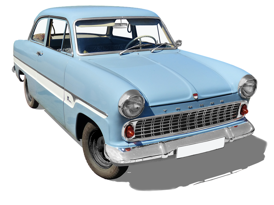 19.99 EUR
Oldtimer 3
Lorem ipsum dolor sit amet, consetetur sadipscing elitr, sed diam nonumy eirmod tempor invidunt ut labore et dolore magna aliquyam erat, sed diam voluptua.
19.99
Details
new
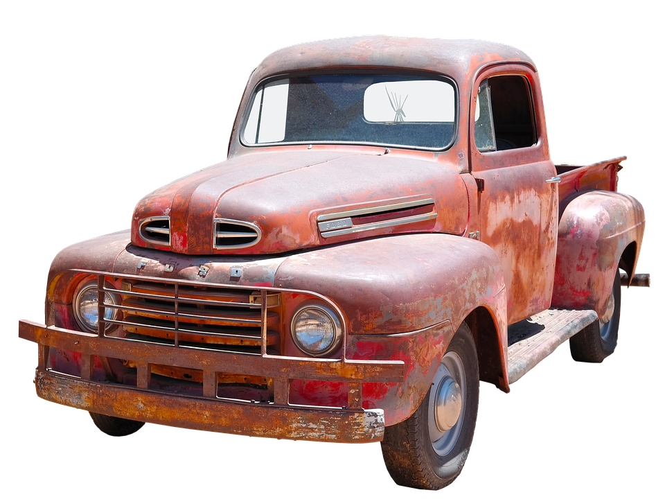 29.99 EUR
Oldtimer 4
Lorem ipsum dolor sit amet, consetetur sadipscing elitr, sed diam nonumy eirmod tempor invidunt ut labore et dolore magna aliquyam erat, sed diam voluptua.
29.99
Details
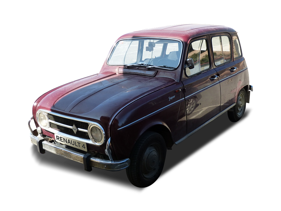 14.99 EUR
Oldtimer 5
Lorem ipsum dolor sit amet, consetetur sadipscing elitr, sed diam nonumy eirmod tempor invidunt ut labore et dolore magna aliquyam erat, sed diam voluptua.
14.99
Details